
Case Study
Sprinkle More
Sprinkle More - Branding
Year
2024
Role
Brand & Packaging Designer
Duration
3 weeks
Type
Branding
Overview
Sprinkle More is dedicated to bringing the finest organic cumin and fennel seeds directly from farm to doorstep. Renowned for their commitment to quality and sustainability, they ensure every seed is meticulously cultivated and harvested.
The Problem
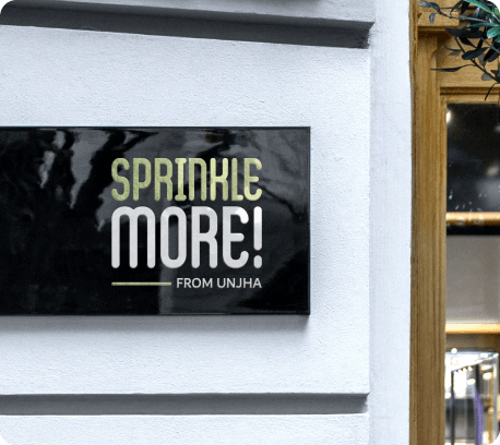
Sprinkle More sought a distinctive branding identity that mirrors their dedication to premium organic products and seamless delivery service. The logo needed to embody simplicity and clarity, reflecting the purity of their organic seeds.
The Solution
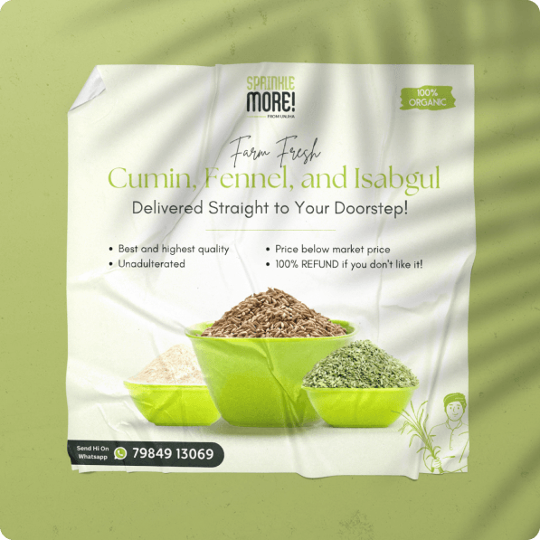
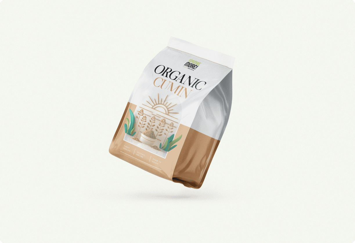
Designed a logo that is a testament to simplicity and quality, incorporating subtle elements symbolizing growth and nature. Extended the brand with vibrant packaging designs that highlight the natural origins of their products.
Approach
A breakdown of the process and thinking behind this project.
Logo Essence
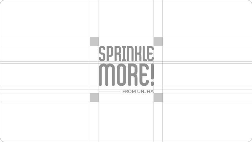
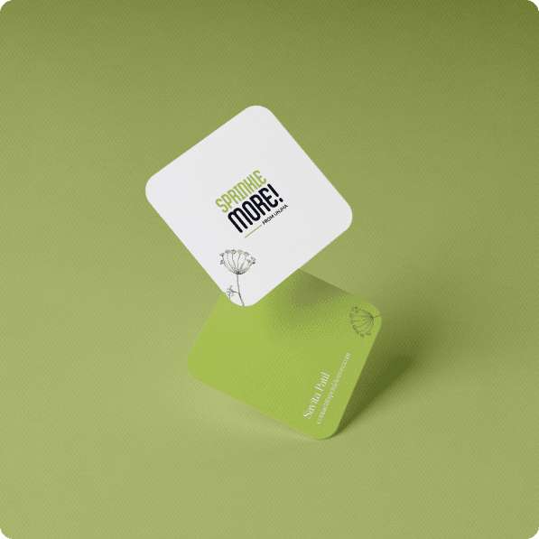
Created a simple, clean logo with subtle elements that symbolize growth and nature, reflecting their organic roots and commitment to excellence from farm to table.
Nature's Palette
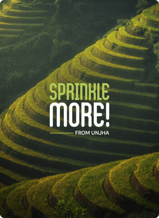
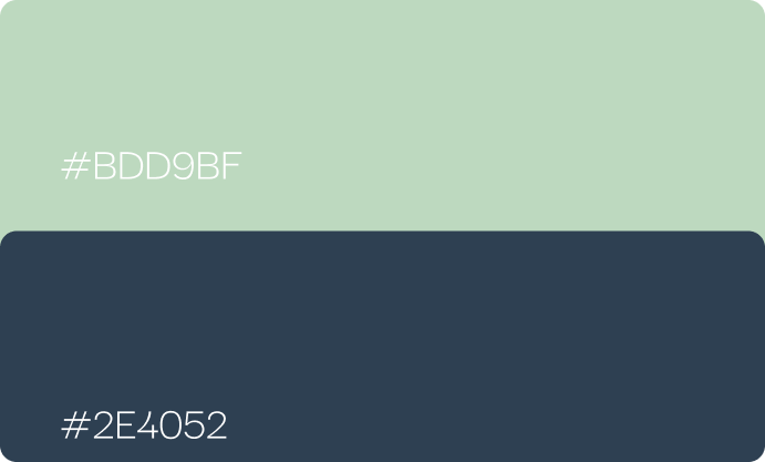
Chose a color palette featuring #B3CC5A to capture the essence of organic purity and natural freshness, evoking the verdant fields where their seeds are grown.
Packaging Design
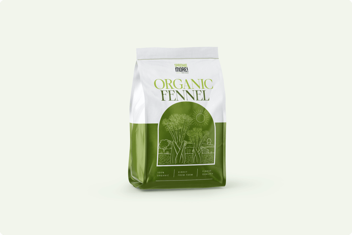
Designed packaging that reflects their dedication to quality and sustainability, featuring vibrant visuals of cumin and fennel seeds emphasizing natural origins.
Results
Key outcomes and impact from this project.
Gallery

Like what you see?
I'm always open to new projects and collaborations.