Case Study
Simon Raks
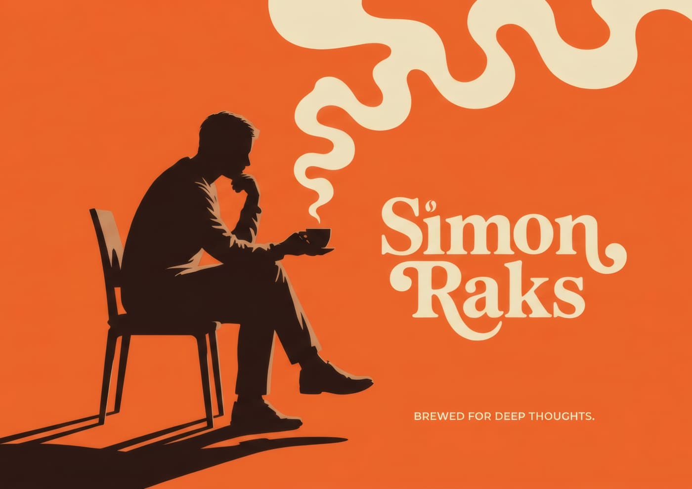
Brewed for deep thoughts. Fuel for people who are building something.
Year
2026
Role
Brand & Packaging Designer
Duration
Project
Type
Branding
Overview
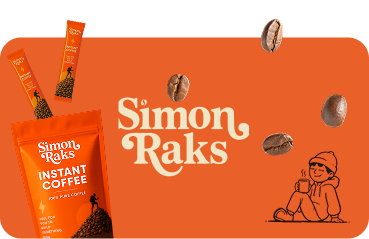
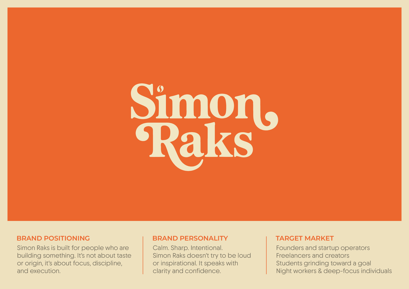
Simon Raks is a coffee brand identity and packaging project for founders, freelancers, students, and night workers grinding toward a goal. The brand is not about tasting notes or origin stories. It is about focus, discipline, and execution. I designed the logo, color system, voice, and packaging around a calm, sharp, intentional personality. The line on pack says it plainly: Fuel for you to build something.
The Problem
Most coffee branding leans cozy artisan or loud motivational. Neither fit Simon Raks. The brand needed to feel like a tool for builders: clear enough to trust, sharp enough to stand out on shelf, and consistent enough that packaging, voice, and logo all say the same thing.
The Solution
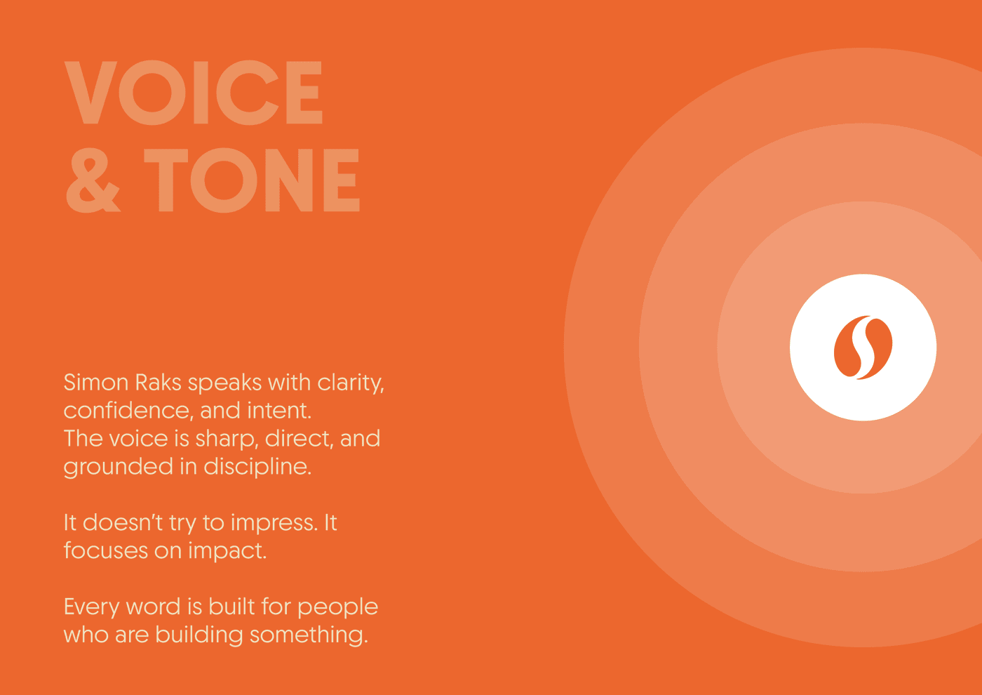
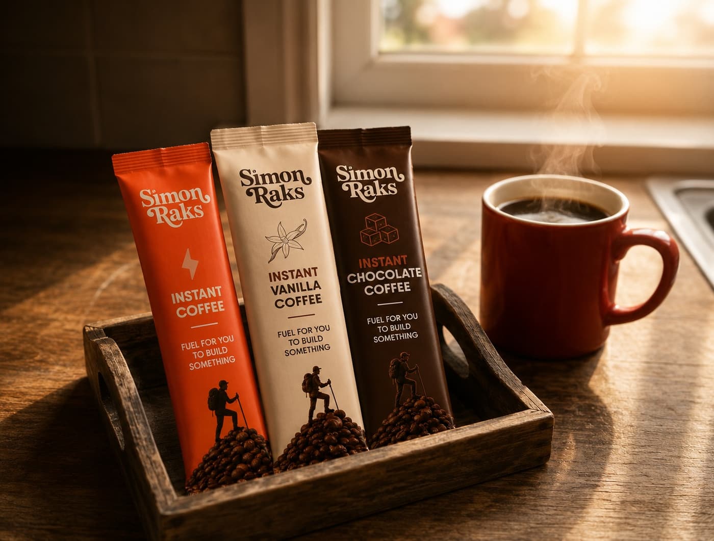
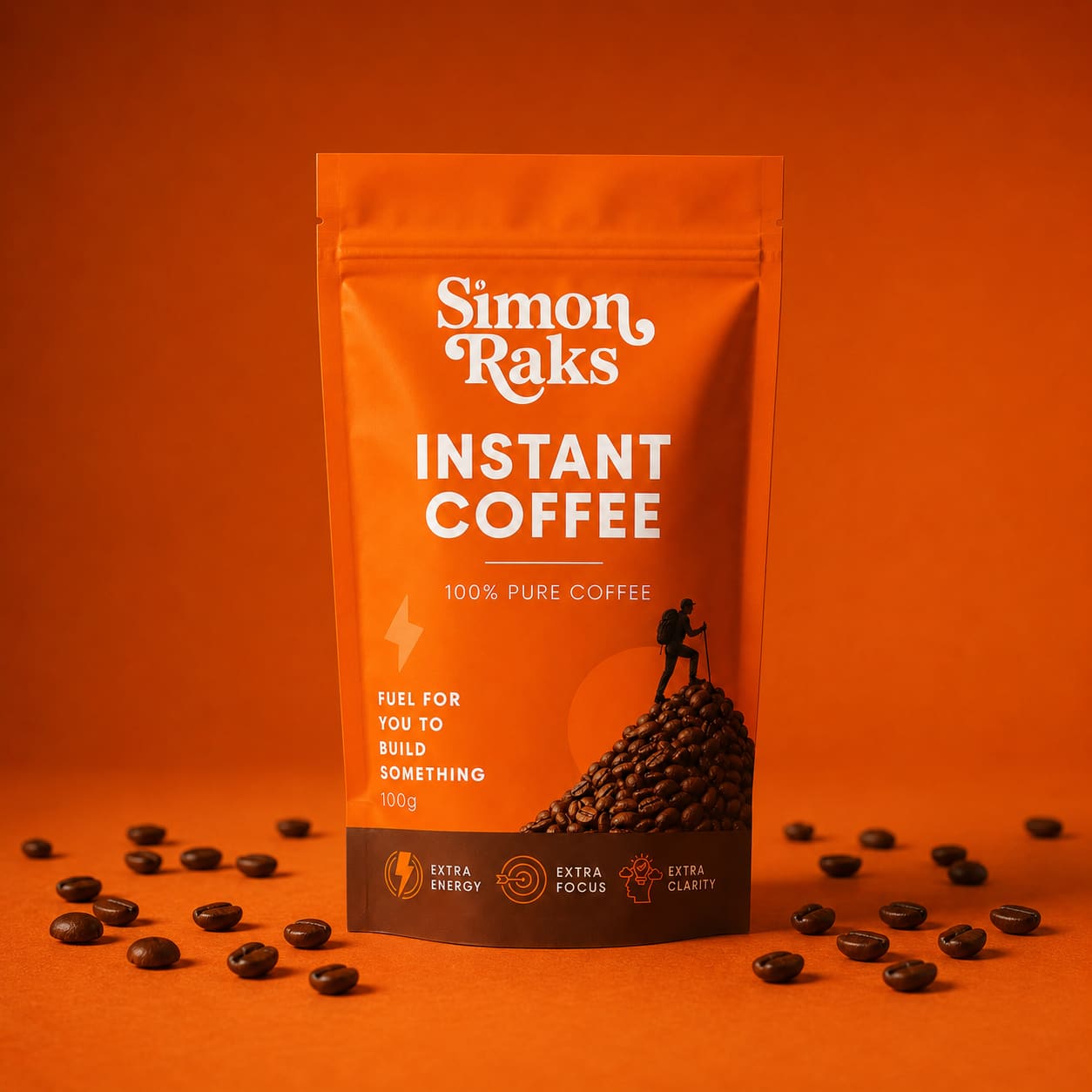
I locked positioning first around builders, then voice around clarity and confidence without pep talks, then a custom typemark with a coffee bean tittle. Warm Orange, Cream, and Black carry every touchpoint. Packaging turns the metaphor visual with a hiker climbing a mountain of beans, plus Extra Energy, Extra Focus, and Extra Clarity on the pouch. Stick packs and flavor variants keep the same system.
Exploration
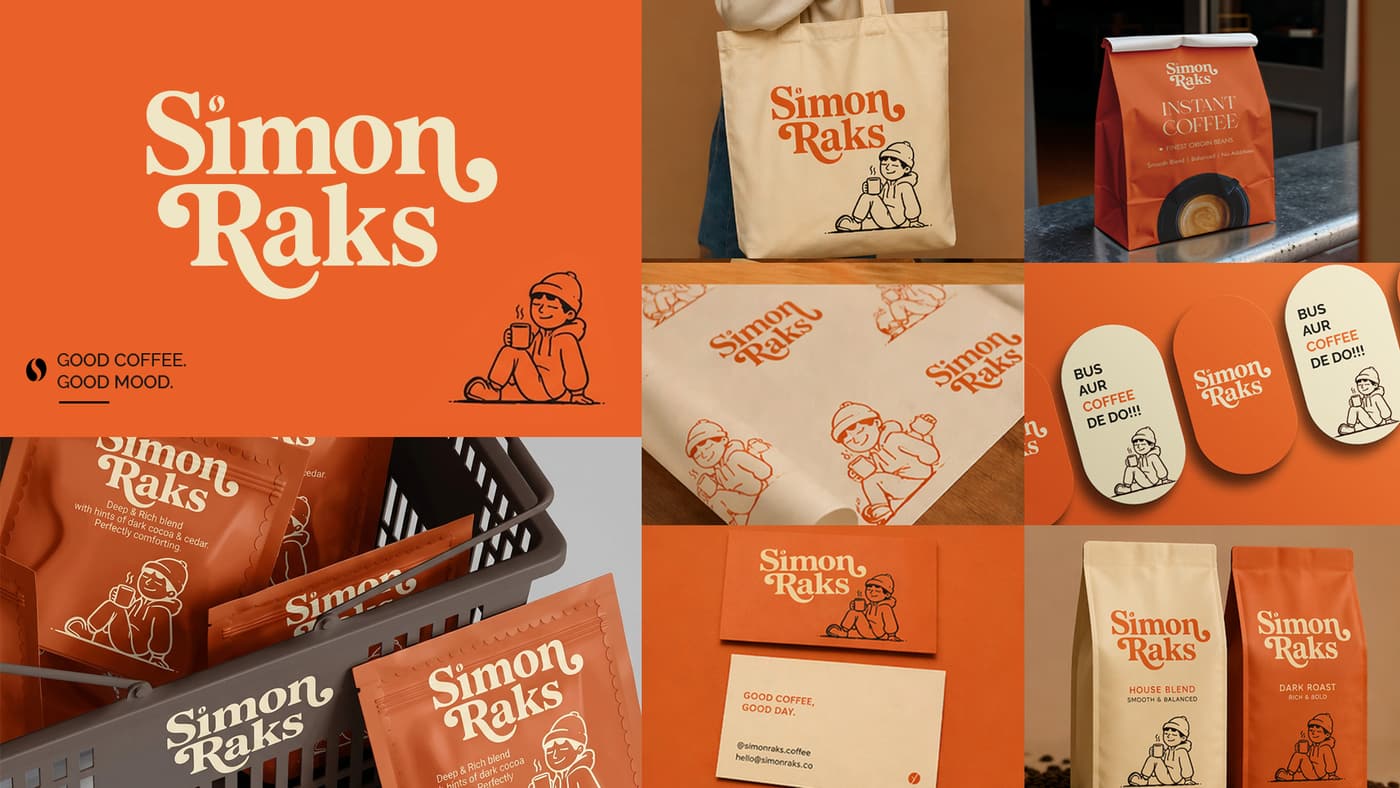
Alongside the sharper builder direction, I also presented a softer playful option with a mascot, tote, stickers, and the line “Good coffee. Good mood.” The client chose the focused identity: fewer jokes, more discipline.

Final Identity
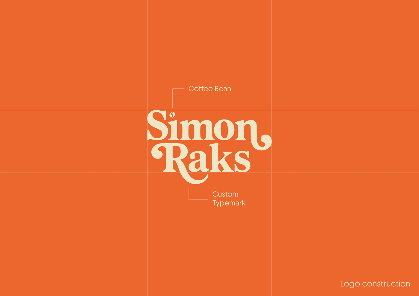
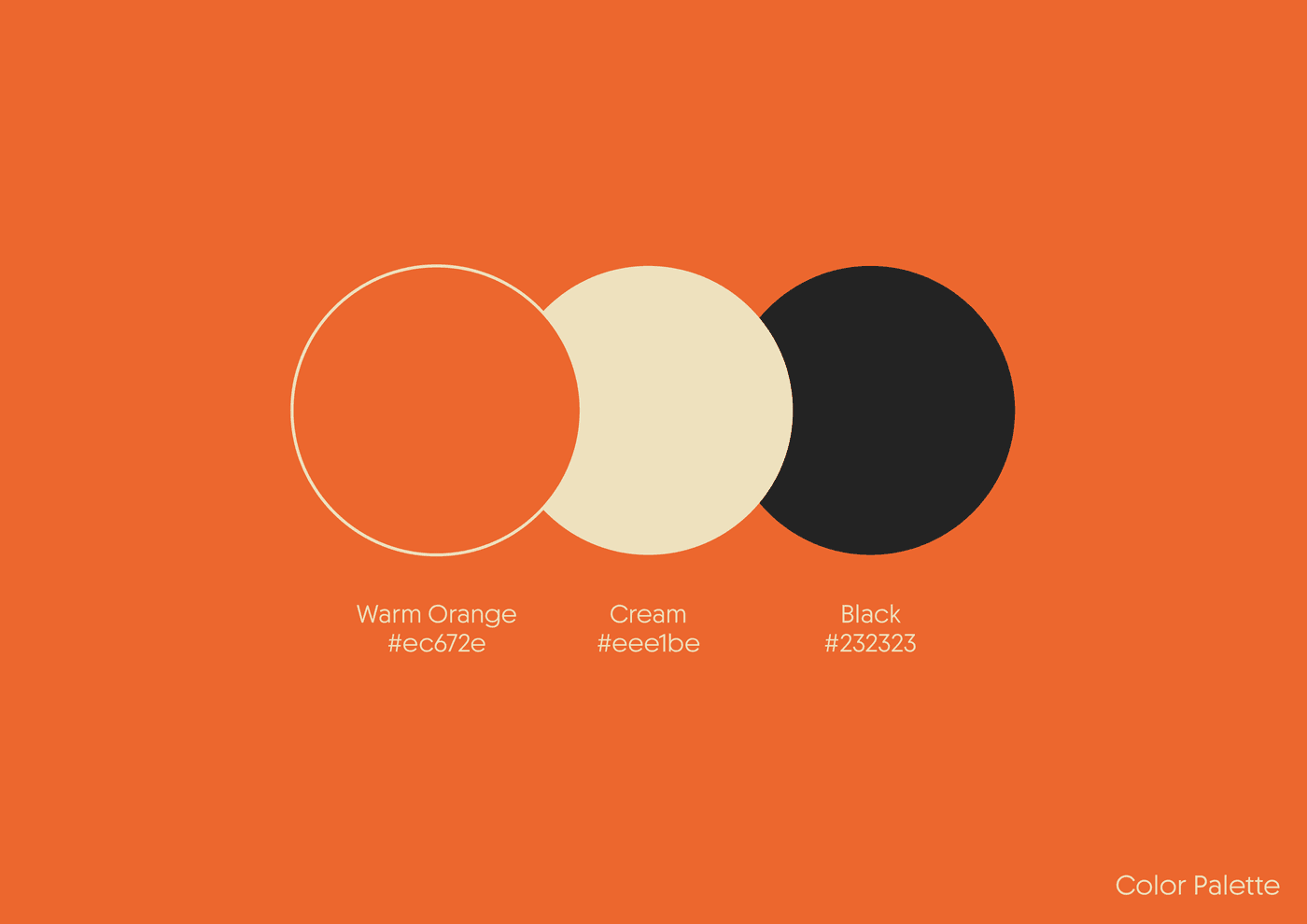
The final identity locks a custom typemark with a coffee bean tittle to Warm Orange (#ec672e), Cream (#eee1be), and Black (#232323). Sharp enough to feel intentional. Quiet enough to stay calm on pack and in digital use.
Packaging
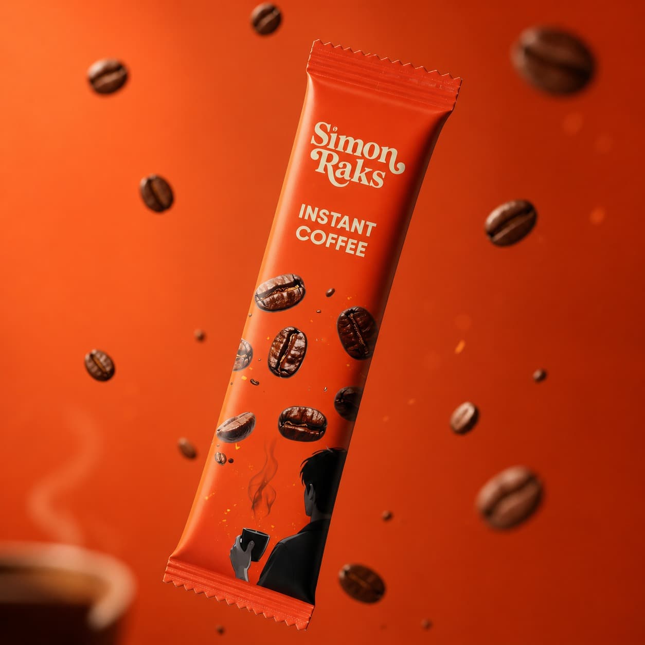
Stick packs and the pouch carry the same line: Fuel for you to build something. The hiker on a mountain of beans makes the climb literal with Extra Energy, Extra Focus, and Extra Clarity.
Results
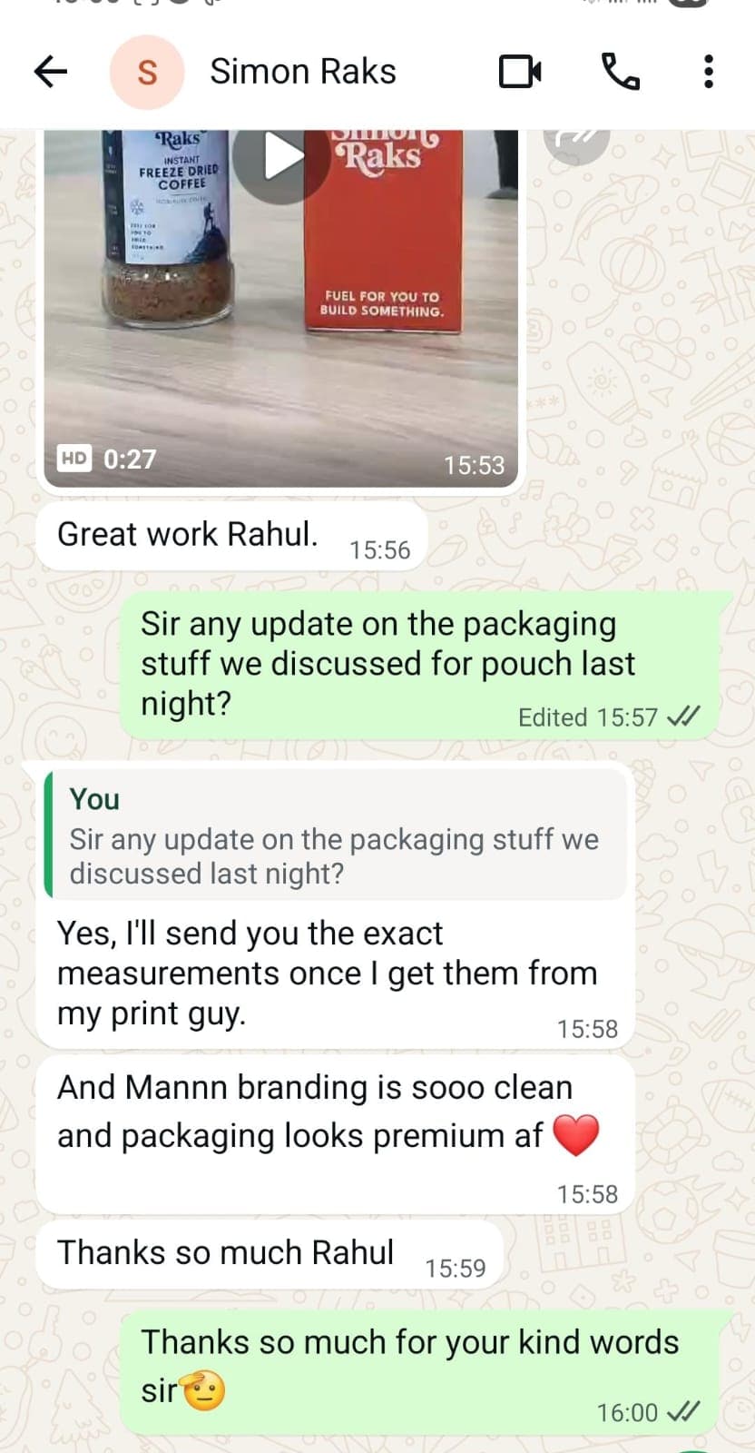
“And Mannn branding is sooo clean and packaging looks premium af”