
Case Study
SafeBub
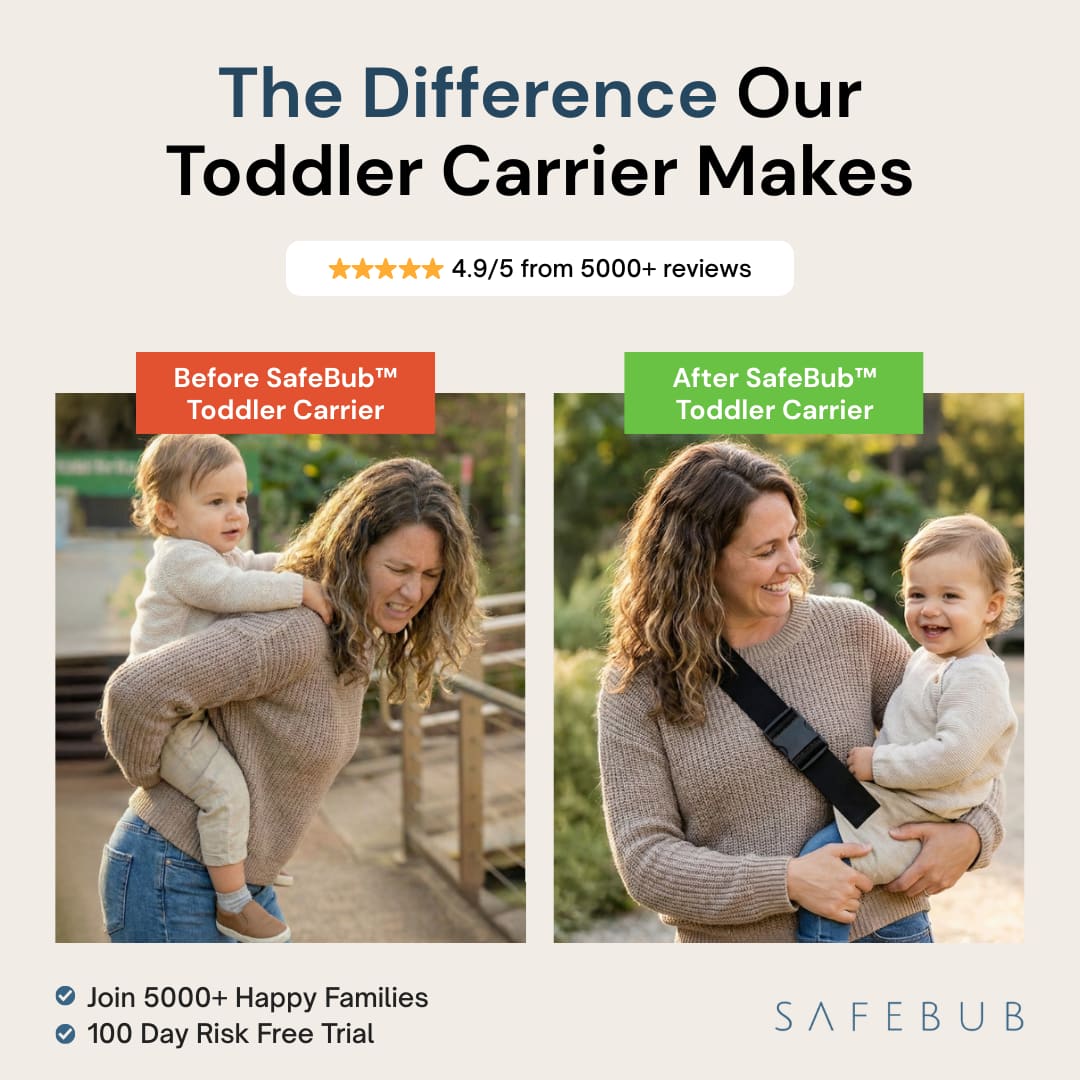
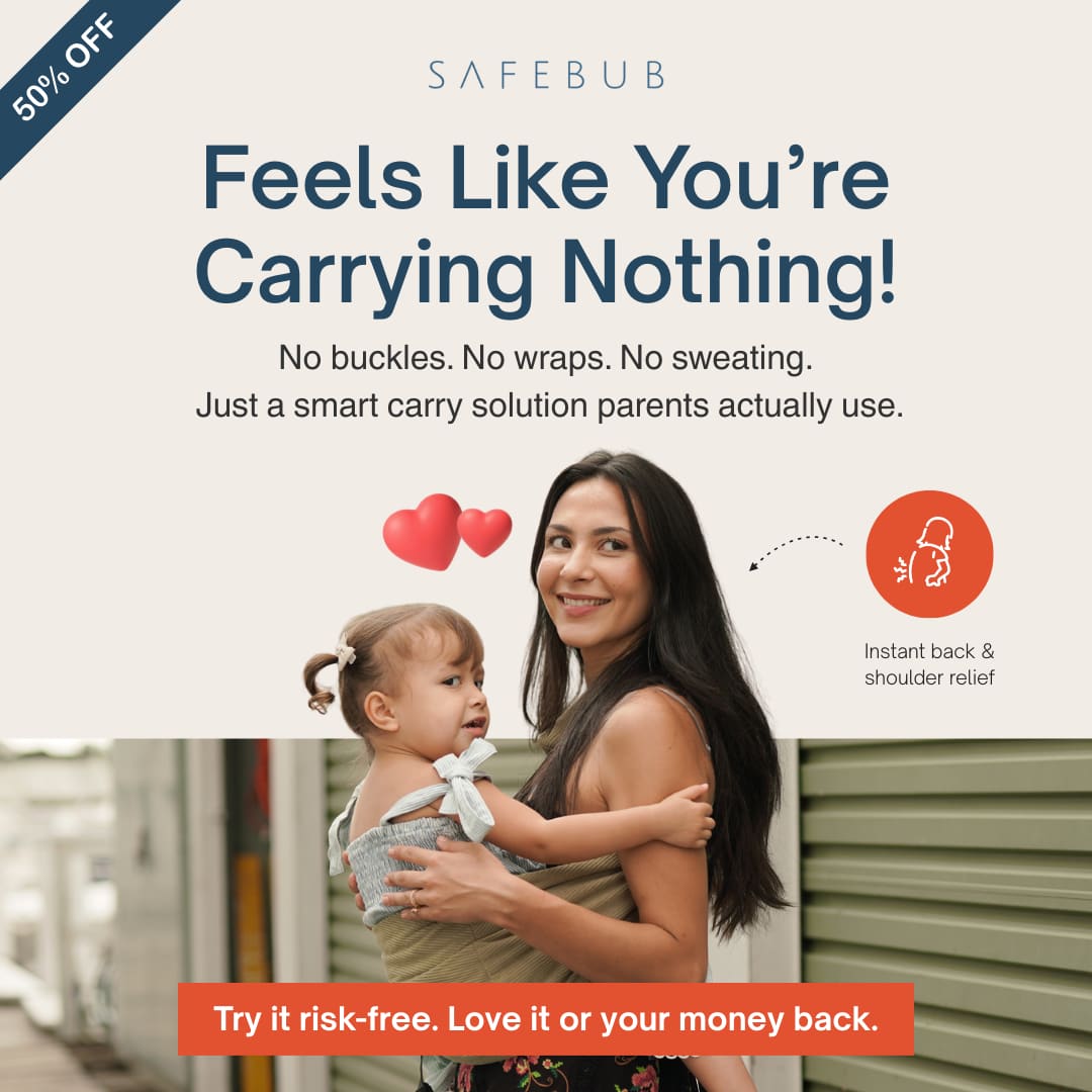
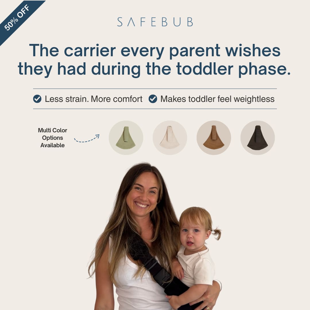
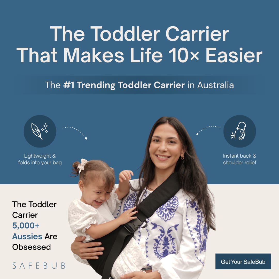
Before vs after. 50% off. Less strain. Meta ads built for Aussie parents, not pretty product wallpaper.
Year
2026
Role
Performance Creative Designer
Duration
Project
Type
Performance Creative
Overview
SafeBub is an Australian baby safety brand known for toddler carriers, babyproofing, and on-the-go safety products. Parents know them for simple setup, peace of mind, and a 100-day risk-free trial. I designed Meta ad statics around what actually moves a parent mid-scroll: comfort vs strain, social proof, and a clear sale.
The Problem
Baby product feeds are crowded with soft lifestyle shots and vague trust lines. SafeBub already had a strong product story, Australia's #1 toddler carrier positioning, flash sales, and thousands of reviews. The creative needed to make that difference obvious in one glance, not hide the offer under pretty parenting vibes.
The Solution
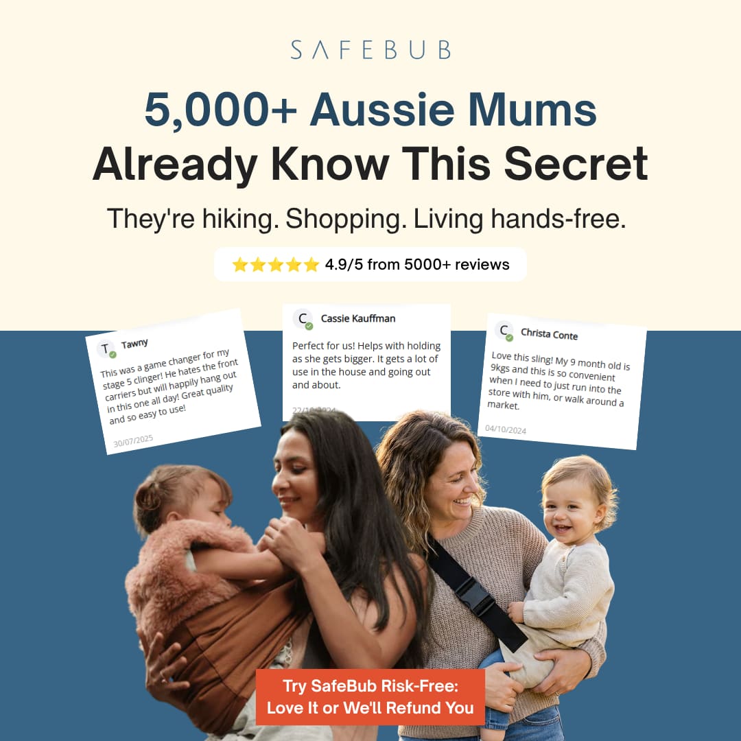
A Meta creative set built around before/after carrier moments, offer ribbons, review proof, colour options, and short benefit lines parents can feel. Same calm SafeBub look. Harder hooks. Clear CTAs toward safebub.com.au.
Approach
A breakdown of the process and thinking behind this project.
Problem-solution hooks
Before SafeBub vs after SafeBub. Hunched strain vs upright comfort. Parents get the point without reading a paragraph.
Offer + proof up front
50% off ribbons, 4.9/5 review badges, 5000+ happy families, and the 100-day risk-free trial where they earn attention.
Product clarity for ecommerce
Carrier on body, multi-colour options, benefit ticks like less strain and weightless feel. Designed for feed and catalogue placements.
Results
Key outcomes and impact from this project.
Meta Ads
Like what you see?
I'm always open to new projects and collaborations.