
Case Study
Hercules Supplements
I made the ads shout the deal. Then I fixed the homepage so the click wasn't wasted.

CTR
2.4-3.1%
CPA
↓ 18-27%
ROAS
3.8-4.6x
Year
2025
Role
Performance Creative Designer
Duration
Ongoing
Type
Performance Creative
01
Overview
Hercules sells supplements online. Collagen. Greens. Gut stuff. Night-time support. The usual. What they needed wasn't another pretty banner. They needed ads that stop a thumb, and a homepage that doesn't drop the ball after the click. So I built a full set of Google creatives for each product, ran clear A/B tests, and redesigned the homepage to match what the ads promised.
The problem
Money was leaking. Ads looked different every week. Sizes didn't match. And when someone clicked through, the homepage felt like a different brand. People bounced. CPA climbed. Nobody could tell you which creative won, or why.
The solution
I locked one offer style across the range. Big price. Clear benefit. Proof you can read in a second. Each idea went out in three Google sizes. I tested pairs on purpose, not by gut feel. Then I rebuilt the homepage so the deal, the product, and the next step felt like the same conversation.
02
Creative System
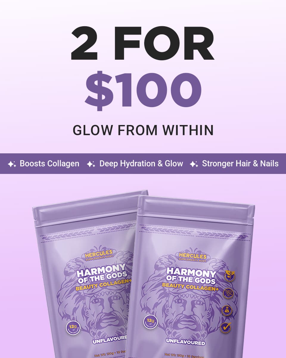
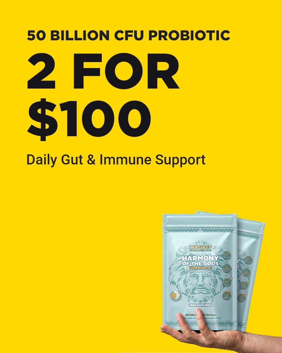
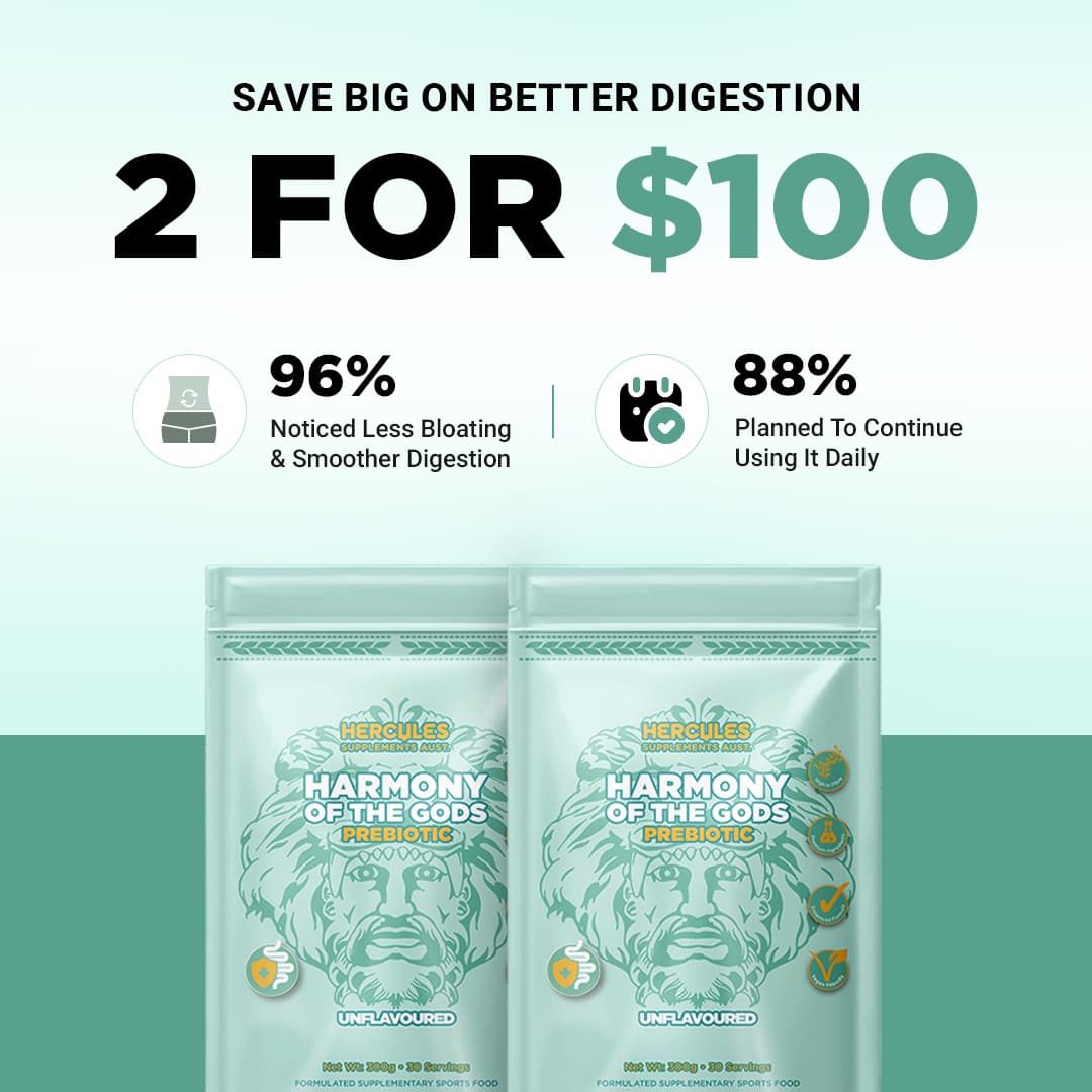
Seven products. Same voice. So the media buyer can swap ads without the brand falling apart every Monday.
Lead with the deal
If they don't see the price in half a second, you've already lost. I put the offer up front, then backed it with proof.
One idea, three sizes
Square, landscape, tall. Same ad, ready for wherever Google puts it. No last-minute cropping chaos.
Test like you mean it
Each A/B changed one big thing. Offer-first vs product-first. Lifestyle vs pack shot. So when something won, we knew why.
Homepage that finishes the job
The ad opens the door. The page has to close it. Same tone. Same offer. Less fluff, clearer next step.
Beauty Collagen
Set 01
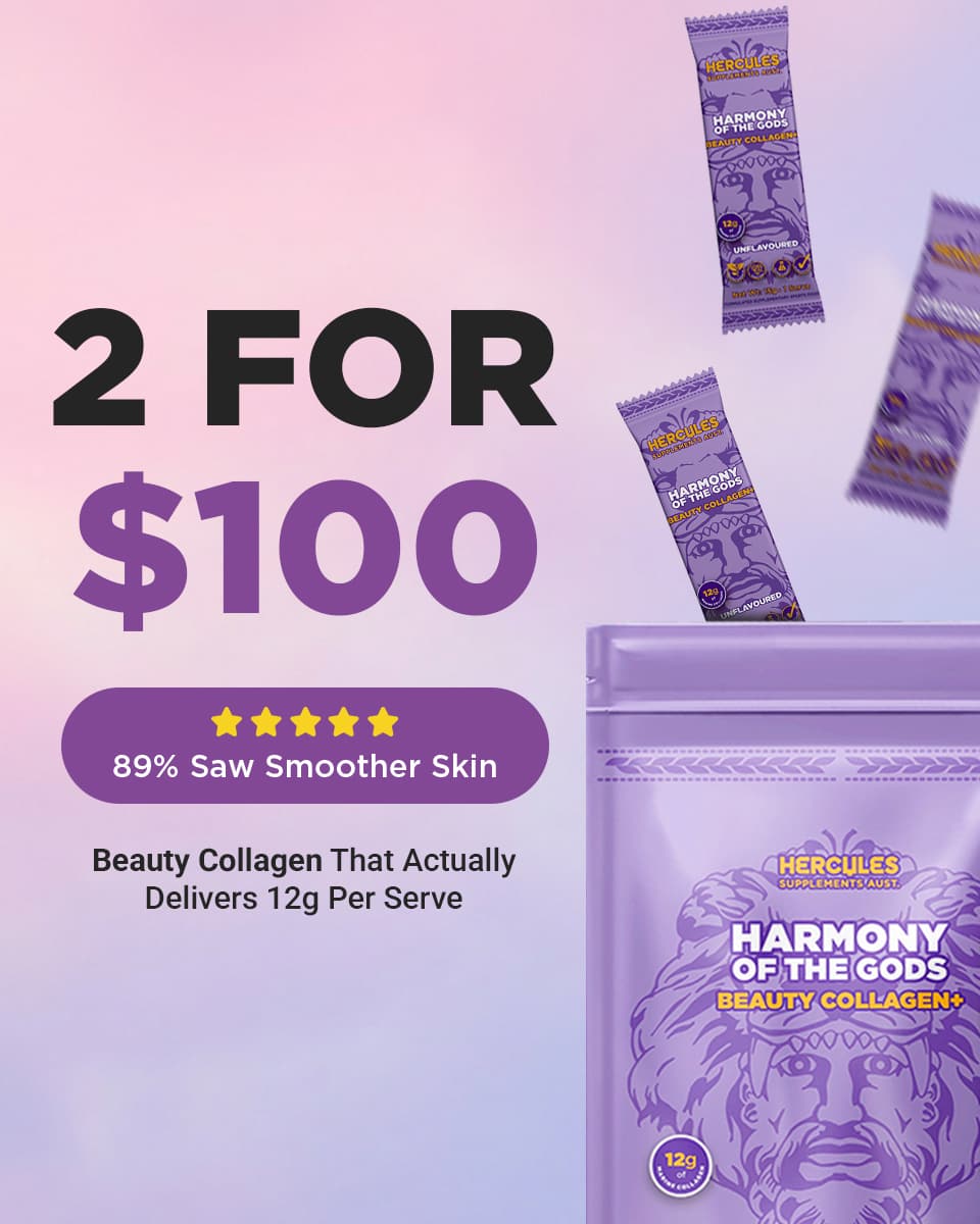
Beauty Collagen · Alt
Set 02
Probiotic
Set 03
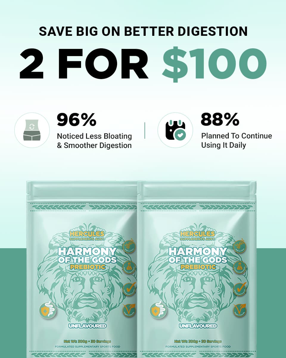
Prebiotic
Set 04
Super Greens
Set 05
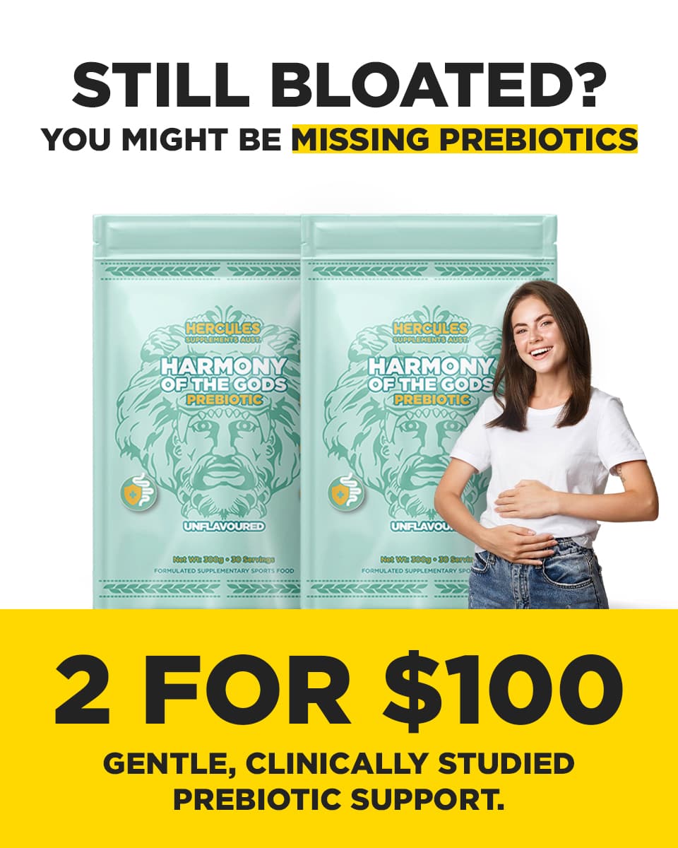
Prebiotic · Alt
Set 06
Hormonal Support
Set 07
03
Formats
Tap a product. Square, wide, and tall. All from the same idea.
Beauty Collagen. Three sizes. One idea.
Portrait
960×1200
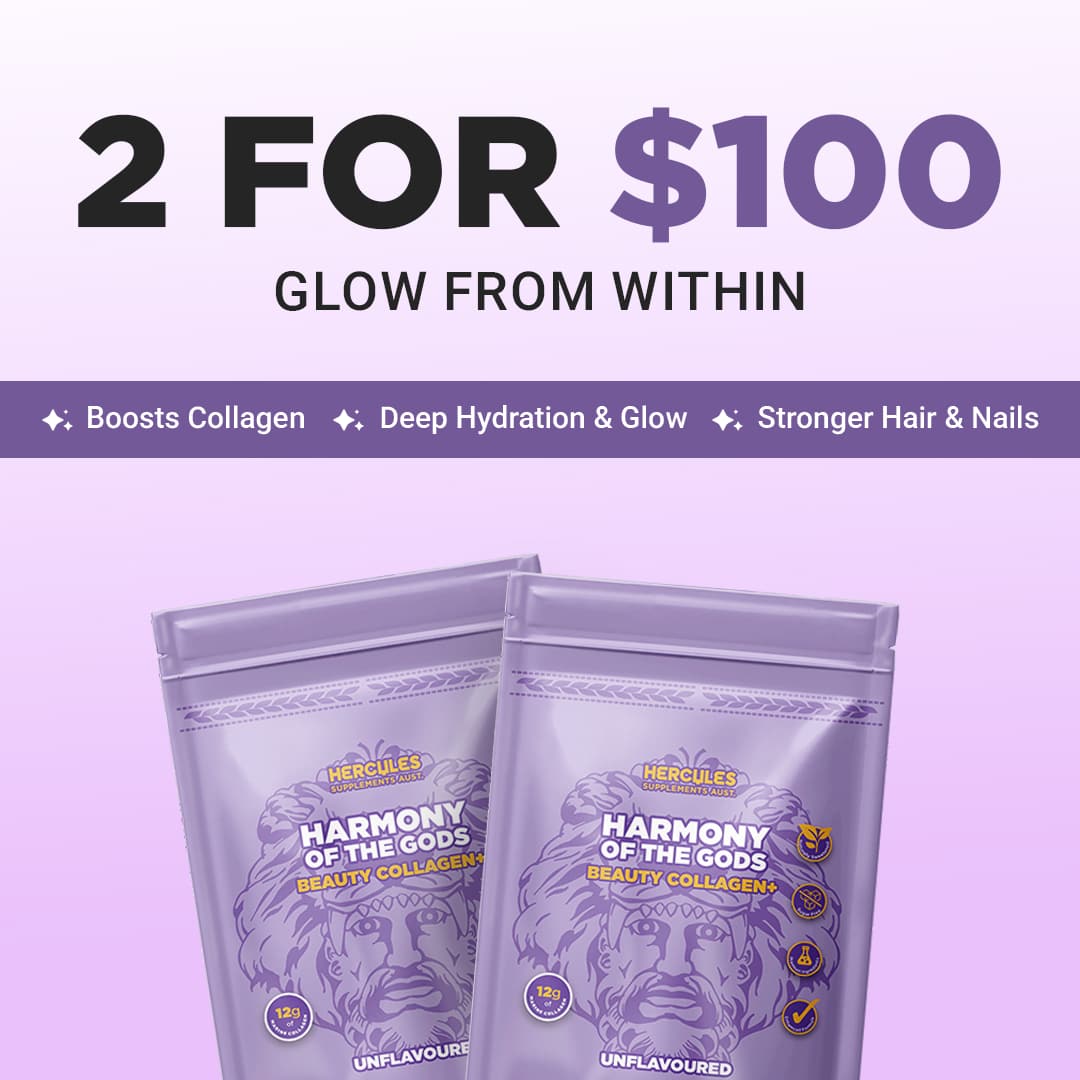
Square
1080×1080
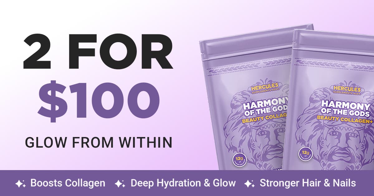
Landscape
1200×628
04
A/B Lab
I picked winners the old-fashioned way: which one sells the deal faster, kills doubt sooner, and still reads when it's tiny. Not fake dashboard screenshots.
Test 01
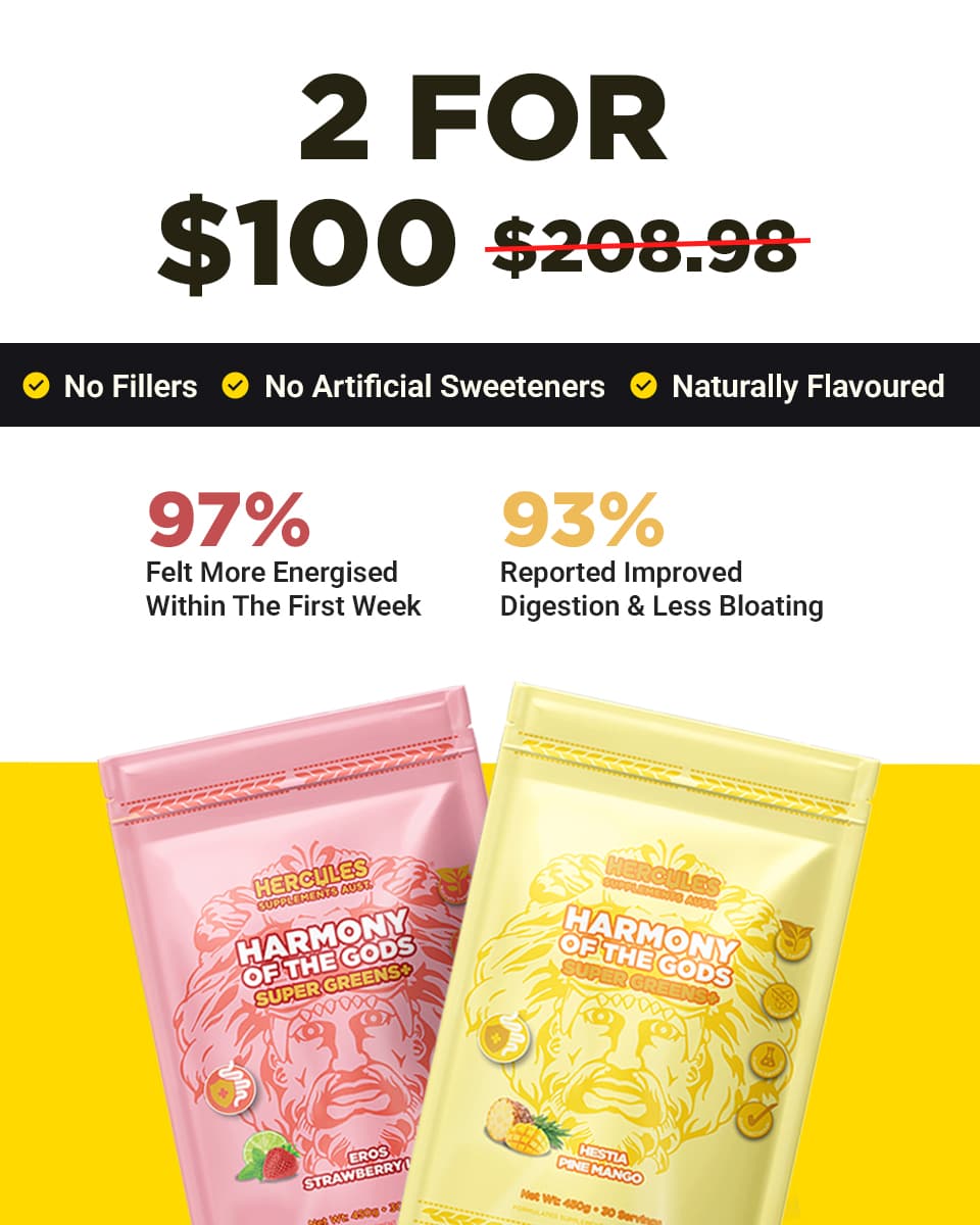
Greens, $100 bundle
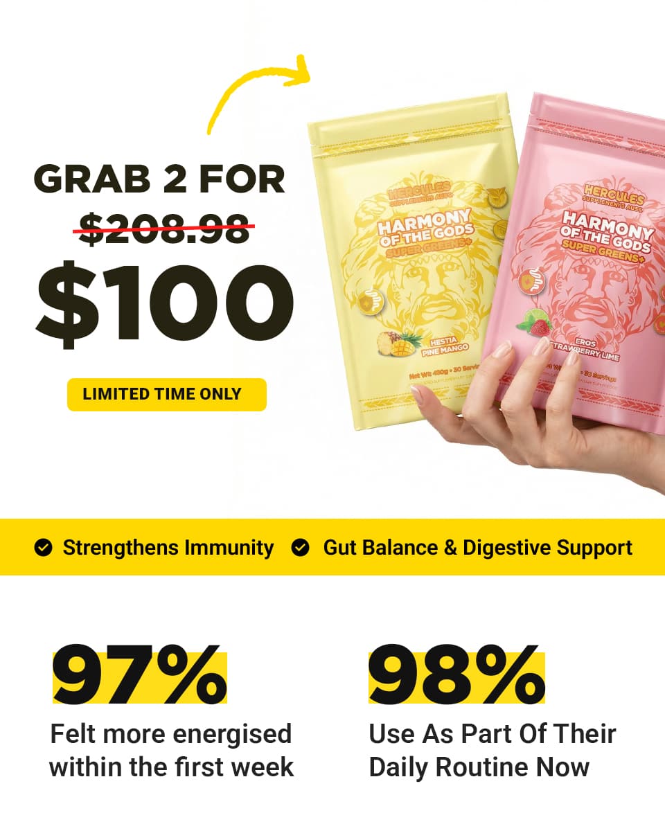
Deal 1 · Product first
Deal 2 · Offer first
Why B won
- You see “2 FOR $100” before anything else. No hunting.
- The black bar kills doubts fast: no fillers, no fake sweeteners.
- “Improved digestion” beats vague “daily routine” every time.
Test 02
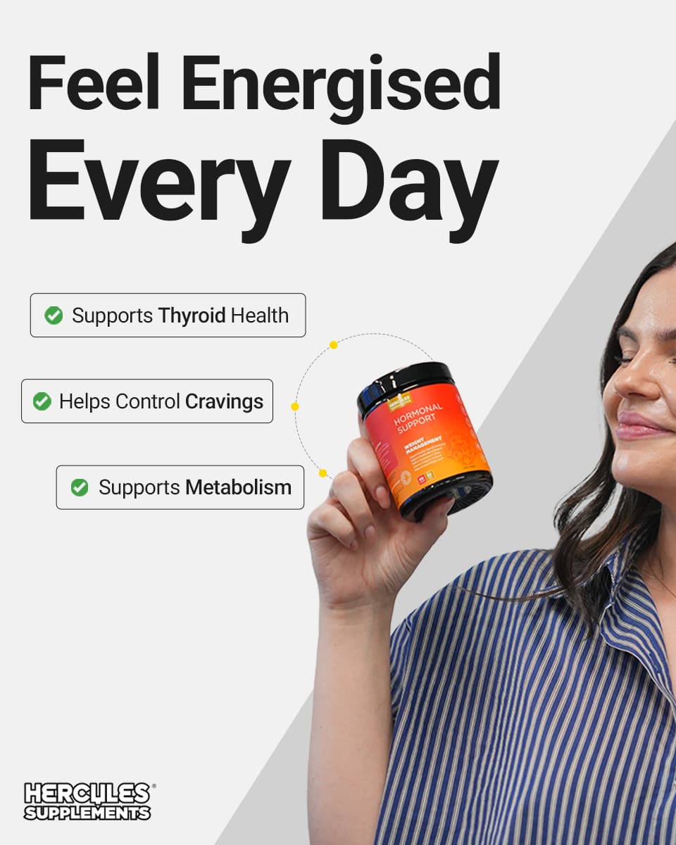
Night-Time Support
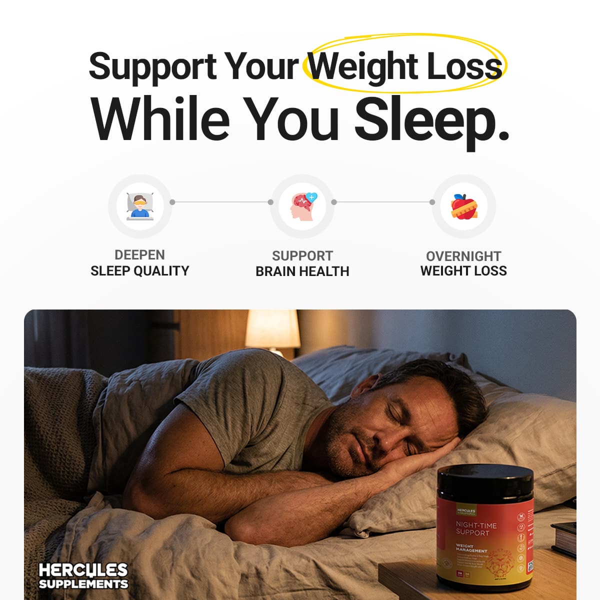
Variant A · Sleep scene
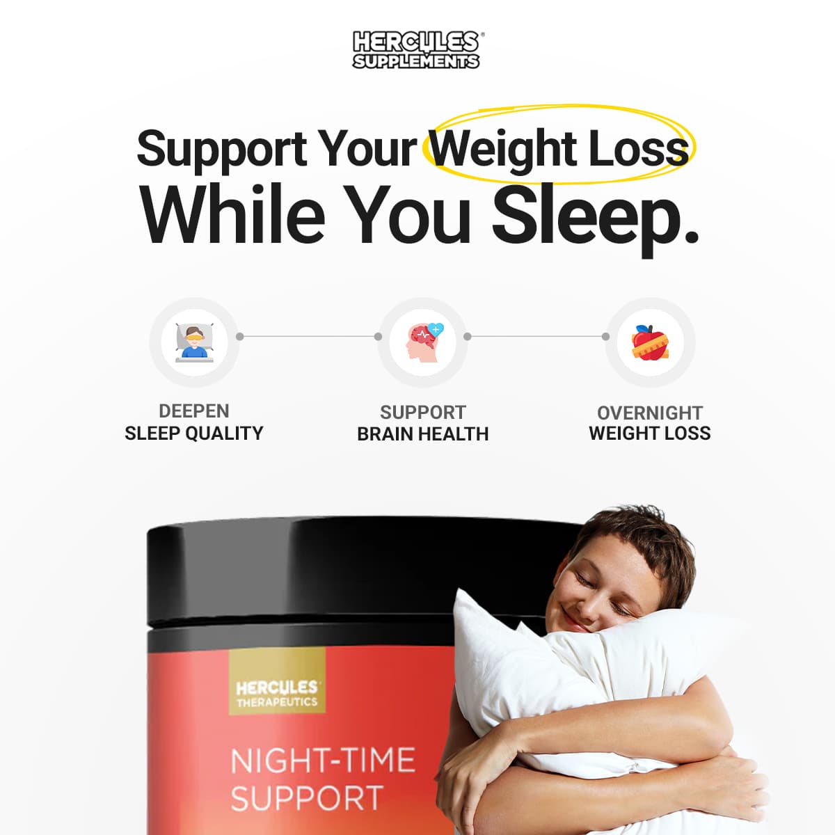
Variant B · Pack + face
Why B won
- Cold traffic needs to recognise the jar. B makes that easy.
- Product on one side, feeling on the other. Clean and clear.
- Logo sits up top. You know who it is before you blink.
05
Homepage Redesign
Getting the click is half the fight. The page has to finish it. Same deal. Less waffle. A path that makes sense.

Scroll inside to see the full page
06
Results
- 7 product creative sets, ready for Google
- 2 A/B tests with clear winners (and reasons)
- Homepage rebuilt around paid traffic
- CTR 2.4-3.1% · CPA down 18-27% · ROAS 3.8-4.6x
CTR
2.4-3.1%
CPA
↓ 18-27%
ROAS
3.8-4.6x
Next
Tired of ads that look busy and do nothing?
I make Google creatives, run proper tests, and fix the pages that waste your clicks. If ads pay your bills, we should talk.